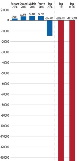
jaredbernsteinblog.com -- In my previous post decrying the extreme redistribution of the tax burden from the wealthy to everyone else, I had to use two graphs to tell the story. I couldn’t fit the increase in tax liabilities for the bottom 80% on the same graph that includes the over $1 million decrease in tax liability for the top 0.1%.
Click here to read full article...
Read more:, , What You Should Know


Got something to say to us? Then send us a letter.
Want us to stick around? Donate to The eXiled.
Twitter twerps can follow us at twitter.com/exiledonline


Leave a Comment
(Open to all. Comments can and will be censored at whim and without warning.)
Subscribe to the comments via RSS Feed